Graphs can be helpful. A properly made graph can quickly give you an understanding of a data set.
If a data set is categorical variables (categories, like hair color, home state, grade level, etc.), you can make one of these graphs:
bar graph
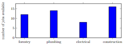
A teenager graduating high school is wondering what jobs are available in the local area. They use an online job board that’s widely used and they find that four jobs are in highest demand.
pie chart
Here’s that same data set as a pie chart:
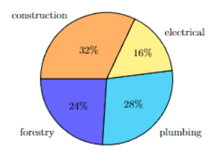
Note that the bar graph and pie chart are graphing the same data set. For example; 32% of the jobs in the data set are construction jobs. There are 16 construction jobs in the bar graph and there are 50 jobs total.
There are many other graphs that work for categorical data other than bar graphs and pie charts.
A pie chart is better when trying to explain the portions that make up a whole amount, like the portions of a diet that are fats, protein, and carbohydrates. A bar graph is better when our goal is to find out which category has the largest or smallest frequency, or when there are many categories. A pie chart does not convey much useful information if there are many categories (roughly 8 or more) because the pie slices are too small to compare to one another.
If a data set is numerical (it’s numbers that you can add, subtract, etc.), then you can make one of these graphs:
histogram
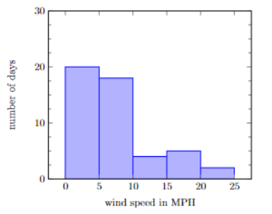
A developer is considering creating a small wind farm on a local hill. They measure the average wind speed on several different days and make a histogram of the data.
boxplot
The developer decides to compare three different locations. They gather data on the average wind speed for several different days in each of the three locations.
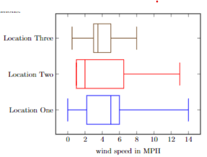
Boxplots are sometimes called box-and-whisker plots.
Let’s look closely at "Location One"’s boxplot. The vertical bar all the way to the left indicates the lowest wind speed of the location, 0 MPH. The vertical bar all the way to the right indicates that maximum wind speed recorded was 14 MPH.
There is a box in the center of the graph. The box tells us where 50% of the data exists. The left side of the box touches just to the right of the number 2 on the x-axis. The right side of the box looks close to the number 6. This indicates that 50% of the data is between roughly 2 MPH and 6 MPH.
The vertical bar in the center of the box is the median. The median represents the cutoff for the middle 50% of the data. 50% of the days for "Location One" had wind speeds higher than roughly 5 MPH, and 50% of the days for "Location One" had wind speeds that were lower than 5 MPH.
Boxplots are more useful when comparing multiple groups, like in the above boxplot example. Histograms are a bit more useful when trying to understand the characteristics of a data set, as histograms could reveal data that is bimodal when a boxplot would not be able to display that information.
misleading graphs
Graphs can be misleading. If you do an internet search for "misleading graphs," you will find a lot of examples! We can review some specific things to look for in graphs.
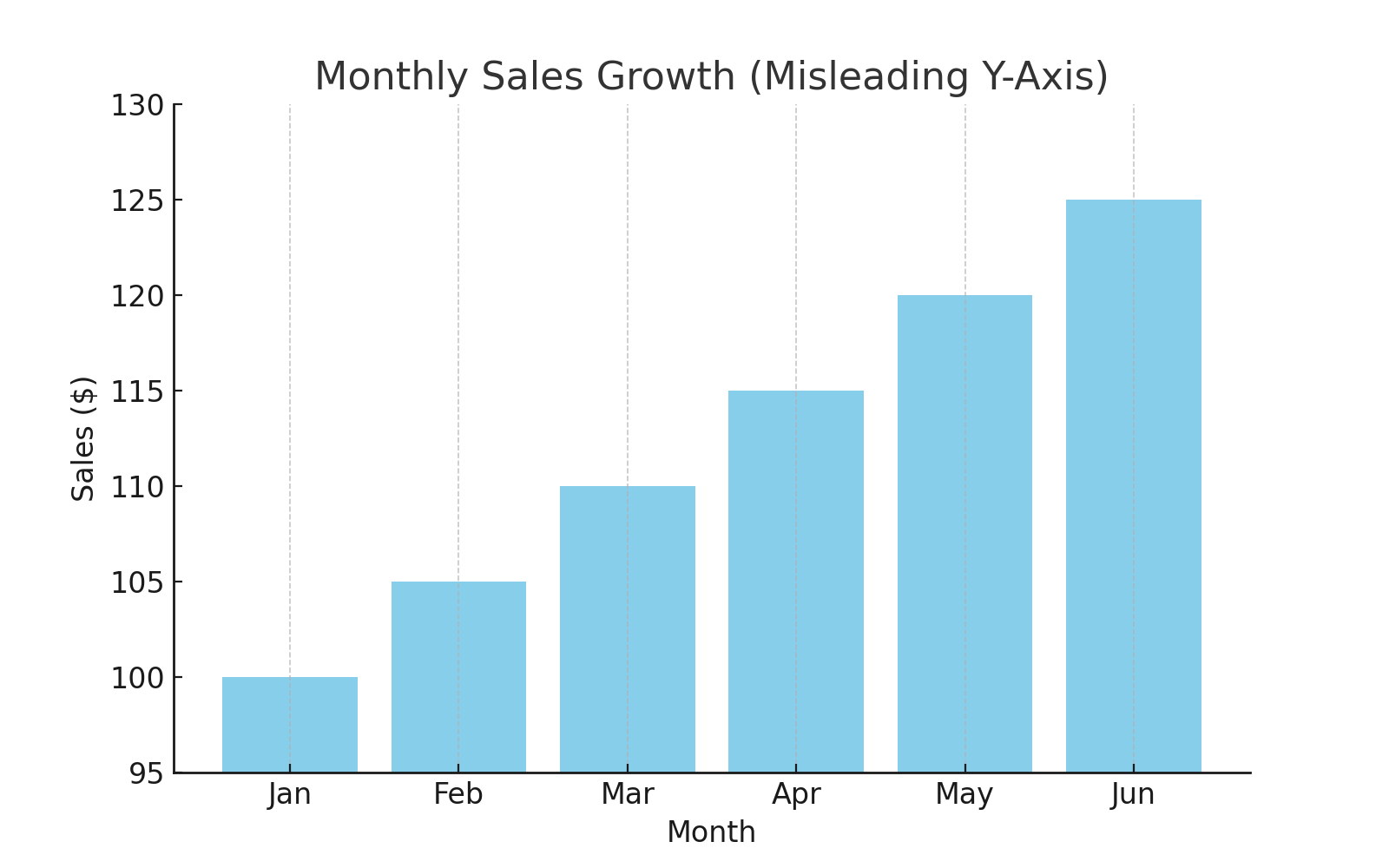
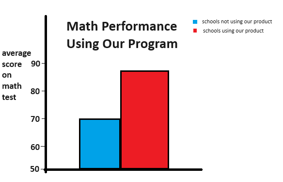
In general, a graph should start at zero on the y-axis (the up-and-down line on the left). If it doesn't, it can mislead the reader regarding differences in categories/variables. For example:

February's bin (bar) is double the size of January's bin. February is only 5% higher than January, though! This graph is misleading because it doesn't start at zero on the y-axis.
The point of a graph is to quickly convey information about a variable. If we add too much data, though, we can confuse and mislead the audience:
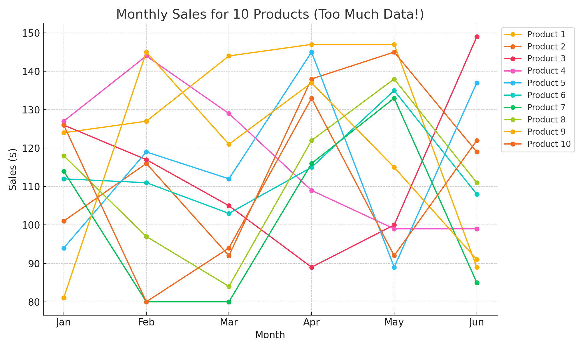
It's difficult to determine what's being told in this graph because there's too much information!
1.
A worker is in charge of reporting the earnings for four different
departments at a company. A primary goal of the report is to identify
which departments are performing the best. The data is below. Make an
appropriate graph for this purpose.
Sales (in thousands of USD)
| department A | department B | department C | department D |
| 524 | 509 | 456 | 499 |
2.
A person is interested in the amount of solar radiation a
particular location receives, as they want to know which location will
produce the most energy. They collect data on two different locations
over 7 days. Create a graph that would be most appropriate for comparing
these two locations.
| location A kilowatt hours per square meter | location B kilowatt hours per square meter |
| 860 | 900 |
| 990 | 952 |
| 804 | 886 |
| 802 | 880 |
| 812 | 700 |
| 858 | 790 |
| 892 | 940 |
3.
A person is investigating the relationship between air pressure
and deer accidents in their local area. They record the following data
set, which represents the air pressure as inches of mercury for each
deer accident that is recorded. Create an appropriate graph to study the
distribution of air pressure for deer accidents.
| inches of mercury |
| 29.8 |
| 30.2 |
| 30.1 |
| 29.9 |
| 30.3 |
| 30.3 |
| 29.8 |
| 29.8 |
| 30.2 |
| 30.0 |
| 30.2 |
| 29.8 |
4.
A person is trying to understand their diet and the source of
their calories. They have the following data set:
| fat | protein | carbohydrates |
| 600 calories | 400 calories | 1200 calories |
Create a graph that is most appropriate for this data set.
5.
The following graph is a recreation of an actual graph a company
created to try to persuade a customer to purchase their expensive
product. What part of the graph is constructed incorrectly? What
aspect(s) of the graph construction misleads the viewer to think their
product is more successful than it actually is?
1. What are some ways a person could create each of these four graphs with the intention of misleading the viewer?