Two variables have a quadratic relationship if the graph of the the increase in one variable causes the other variable to gradually increase until it reaches a maximum, then the other variable begins to fall. Or, a quadratic relationship between two variables can happen if one variable’s increase causes the other variable to decrease until it reaches a minimum, then start to increase.

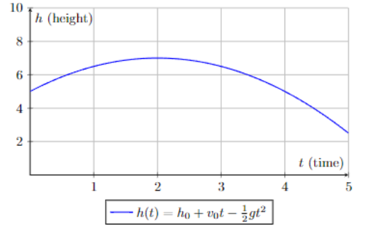
A quadratic relationship looks like this:
The x-axis is time and the y-axis is height. The object starts at 5 units of height when time is zero (t = 0). The object reaches its maximum at time unit 2. The maximum height appears to be 7 height units. The object then begins to fall.

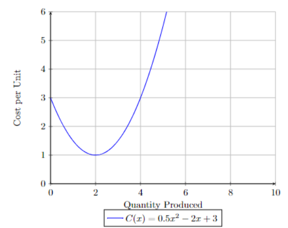
This graph is also quadratic. We call this type of quadratic a negative quadratic as it has a minimum.
1.
https://www.youtube.com/watch?v=WA9POyoDaFsThe data below represents the relationship between a car’s speed
at the time of an accident and the skid left by the car.
| miles per hour | length of skid in feet |
| \(10\) | $6 |
| \(20\) | $22 |
| \(30\) | $50 |
| \(40\) | $90 |
| \(50\) | $140 |
| \(60\) | $200 |
Is the relationship between miles per hour and the length of the skid quadratic?
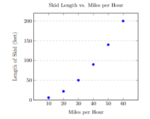
We have not learned the tools to algebraically determine if this is a quadratic relationship, but we can make the determination visually. We should sketch out a scatter plot. To make a scatter plot, label the x-axis as the miles per hour, and the y-axis as the other variable, the length of the skid.
Next, note the highest and lowest x-value. For our data set, x = 10 is the lowest and x = 60 is highest. We make 6 vertical lines on the x-axis, one for each value of our x-variable.
Do the same for the y-axis. The lowest value is 6 and the highest value is 200. We can make however many horizontal lines we’d like. We can start at y = 0 and count by 50s, which would mean we can stop after 4 horizontal lines.
Place dots that correspond to the data points in the table. The scatter plot looks like this:

This one is tough to determine, as we cannot see the minimum to be sure. We can say that it looks quadratic. Let’s take a look at another example.
2. A business wants to charge a price for their product that maximizes their profit. If a business charges too much, customers are scared off. The following table represents the price set for different products and the total profit based on that price.
| price | number of purchases |
| $100 | $60,000 |
| $120 | $66,440 |
| $140 | $69,600 |
| $150 | $70,000 |
| $160 | $69,600 |
| $180 | $66,440 |
| $200 | $60,000 |
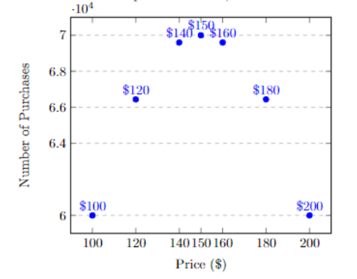
If we make a scatterplot of the data,

This data makes an upside down U, similar to the first example at the beginning of this document. That’s a quadratic shape!
1. A water heater is installed in a house. The temperature for a water heater is recorded below. Is the relationship between time and temperature quadratic?
| hour | temperature (F) |
| $0 | 40 F |
| $1 | 69 F |
| $2 | 93 F |
| $3 | 112 F |
| $4 | 125 F |
| $5 | 132 F |
| $6 | 135 F |
2. This data comes from fuel economy.gov and has been slightly modified to make graphing easier.
A certain vehicle’s miles per gallon is tracked based on its driving speed. Is the relationship between speed and miles per gallon a quadratic relationship?
| hour | temperature (F) |
| $5 | 10 F |
| $15 | 20 F |
| $25 | 28 F |
| $35 | 30 F |
| $45 | 31 F |
| $55 | 31 F |
| $65 | 28 F |
| $75 | 23 F |